01 Logo System
The mark and its uses.
A circular double-bolt glyph paired with the logotype in Azeret Mono. Three variants serve every production context: full lockup on dark, full lockup on light, and the mark alone for constrained spaces.

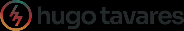
Reverse · On Dark
Primary in-context. Logotype in Silver (#E8E9E9) on dark surfaces. Bolt mark retains the iridescent gradient at all times.

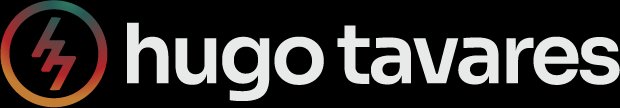
Primary · On Light
Used on white and off-white surfaces. Logotype: near-black (#232828). The gradient mark is unchanged — the one constant across both themes.

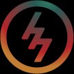
Mark · Icon / Avatar
Isolated bolt for favicons, social avatars, and space-constrained contexts. Minimum 24px digital / 8mm print.
Clear Space
Equal to bolt mark
height on all sides
height on all sides
Minimum (Lockup)
160px digital
44mm print
44mm print
Minimum (Mark)
24px digital
8mm print
8mm print
Preferred Format
SVG (scalable)
PNG (raster)
PNG (raster)
Logo Don'ts
Recolor the logotype outside near-black or white
Separate the mark from the lockup without intent
Apply drop shadows, glows, or any filter effects
Stretch, distort, rotate, or skew the lockup
Place dark-version on light surface (or vice versa)
Reproduce below the minimum size guidelines